The concept art process is almost reaching its end! Now it's becoming a matter of refining the art and designs we have now so we can place them into our final art style guide. Fortunately, we have already begun working on a draft for that. It stands at almost 20 pages at the moment, with the sheer amount of art, influences, visual effects, and other animations that would be helpful to include. That guide will be shown next week, along with our final motion graphic.
This week, we managed to almost finalize half of our character concept art. Our means of applying three-toned shading has become far more unified than it was before and enabled our characters to look as though they're from the same world, at the least. Tighter unification between our hatching styles could stand to be made, along with other edits. We'll be using the last week before Vertical Slice to nitpick and refine those details.


Last week, our lighting left something to be desired. Since then, Ashley has worked on some potential lighting setups based on the themes we had last week!

There's definitely more of a crystal-laden fantasy vibe in each of these set-ups! And far more dynamic.


Here is another iteration of the corrupted ley line effect as well as a first pass for the gravity well.
For the last few weeks, we've been posting our progress in creating proxys for Ley Lines early on. This week, Lauren was working on the proxy model for Vala!

She's looking pretty great so far and is definitely catching those Moebius-esque proportions.

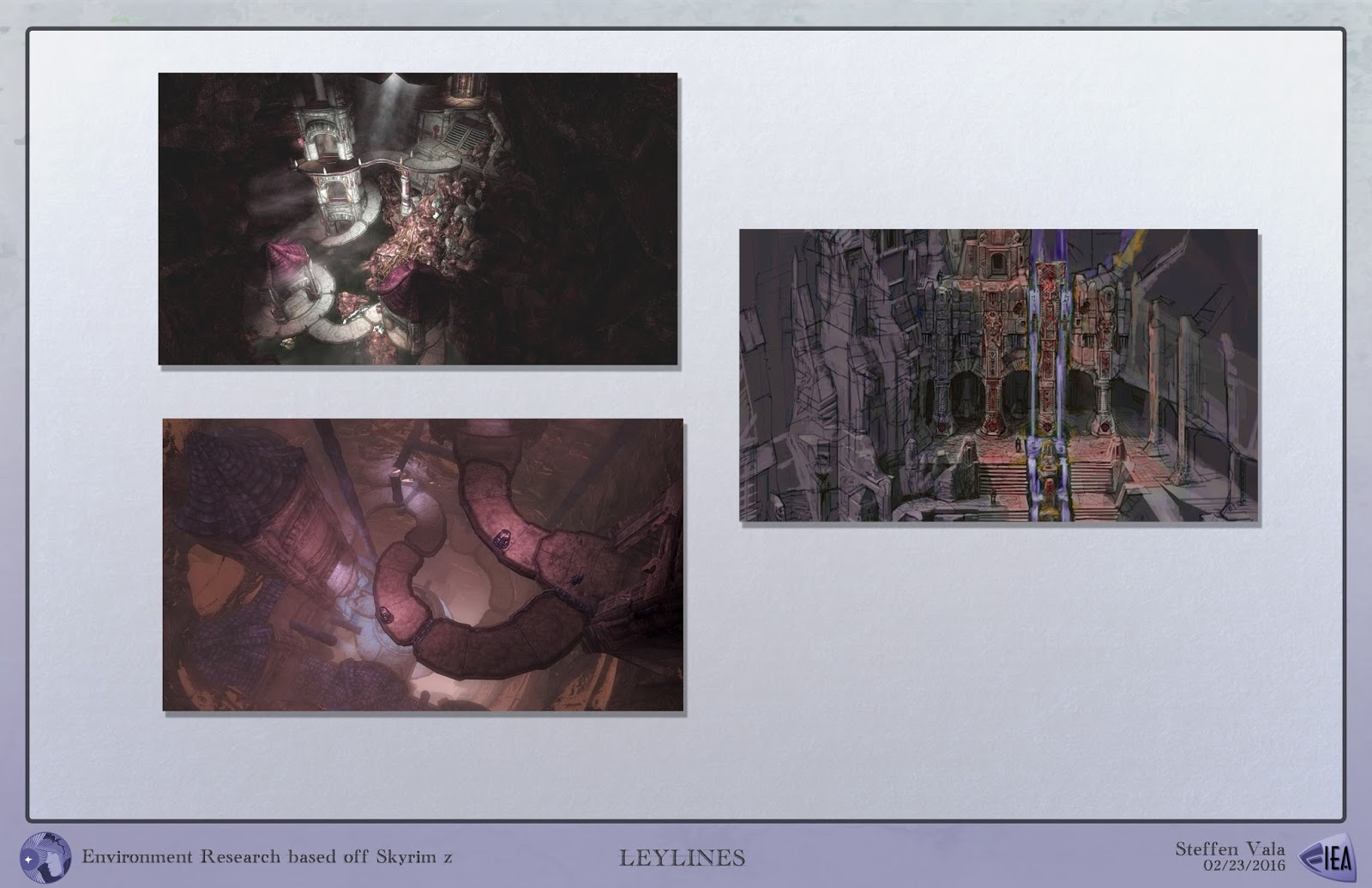


More environment concepts! A variety of sources have been used to play around with different architectural styles that could be incorporated into Ley Lines. One such reference came from Sudano-Sahelian architecture, as seen with the more natural concepts above created by none other than Steffen. With this type of architecture, Mirians are much more attuned with nature, using man made structures with the earth instead of against it. Light shines through, not only by the crystals themselves, but through "spouts" that serve as a sort of spot light into the rooms.
Bellow the geomancy style comes something much more man made. Roselyn and Lauren worked on the idea of reusable man-made structures to various degrees. Roselyn decided to work with something much more structured and symmetrical (while keeping in mind the "holy" aspect of the room. A way to counter the asymmetry flooding the rooms by the Shellek. Only thing earthy about this design would be the material the pieces were made out of, and the carved walls. Lauren, on the other hand, worked on a separate room design, working with placements and tiles to have a more "holy" appearance as well as indicating variety and different levels of destruction.
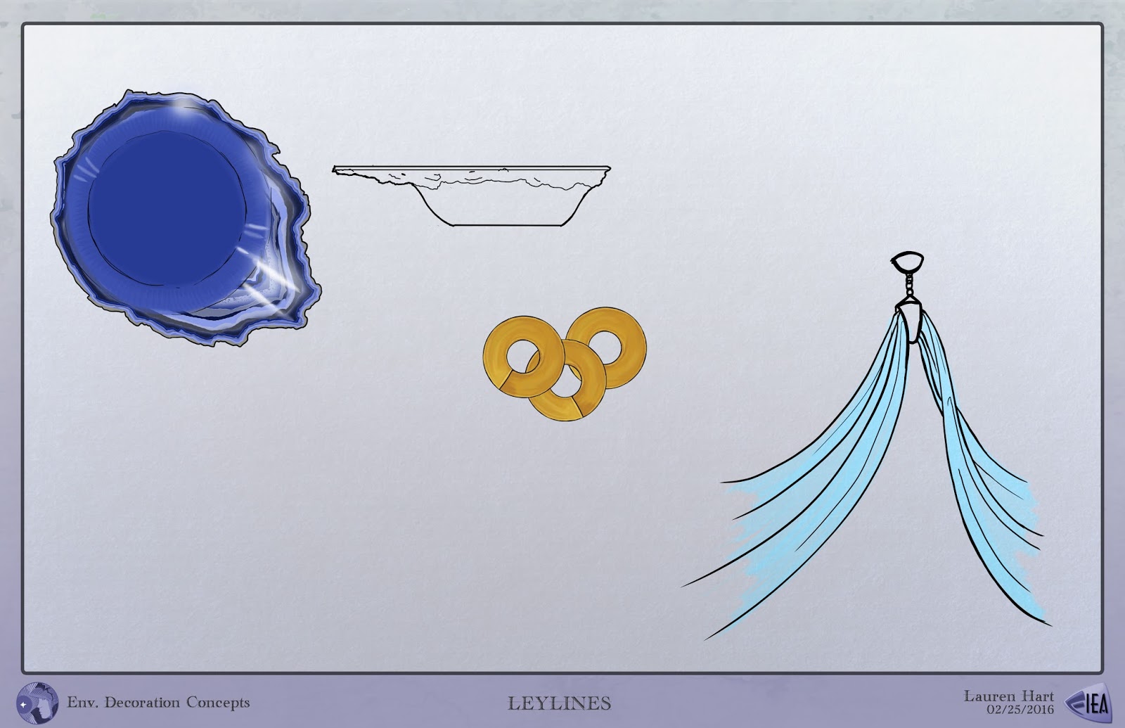
Lauren also did some work on figuring out some of the decor items for the rooms to make them feel more "lived in".
Onward to everything to do with the user interface! We have plenty of designs for that going on too.
One of the most important things for branding our game are our logos! Because one of the concentrations for this week rests on logos, we developed a few to go along with the one Lauren developed a little while back.


Every member on the team did some concepts for the Heads Up Display. We had to indicate a number of things to go along with our game mechanics: stamina, a sprint meter, and the two Ley Line energies being harnessed at a given time. After a meeting with our design team, Roselyn worked on developing a second pass at the HUD to incorporate the design elements we thought were the most successful.
We had a number of icons to develop this week! Some important ones for in game, were the bridge creation icons (which indicates the start and end point of bridges the player can make), and warp points (indicating where the player is able to warp/has warped in the past). We also mocked up some designs that could go on the torn banners present in the temple - those designs would be something of an insignia for the temple guards as well. And lastly, we included some designs for our game start-up icons, which the player will see right on their desktop.


One of the persistent problems in our design process is that there wasn't a clear visualization of what Ley Lines will look like when someone is actually playing the game. This week, we've worked on that! We mocked up some images of how it may look in-game (though, take the lighting with a grain of salt) and menus for the interface. This is something of a gist for what everything will look like! Clearly, HUD, colors, and the logo are subject to change when we decide on the finalized versions.

Now for fonts! The two main fonts we'll be using are the Mirian Temple Script we developed last week and "Sansation Regular". The latter font is easy on the eyes to read, has a slight sci-fi feel (without being overtly so), and is 100% free (one of the best perks).
No comments:
Post a Comment